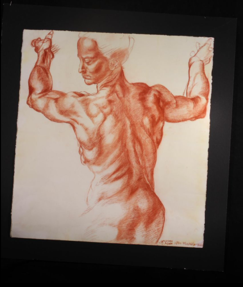
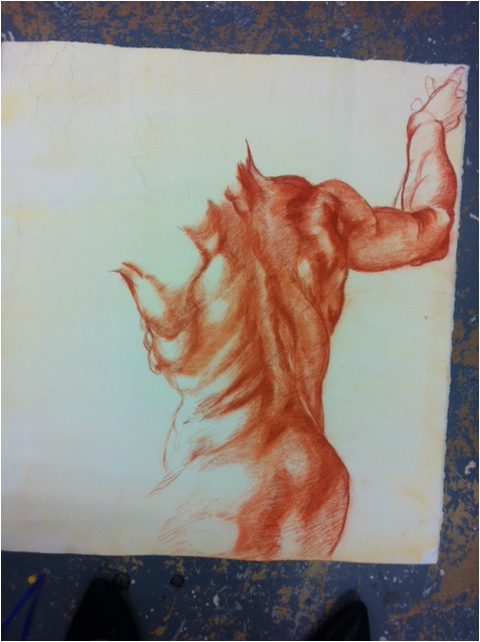
Finally finished my copy of Michelangelo's drawing!
|
|
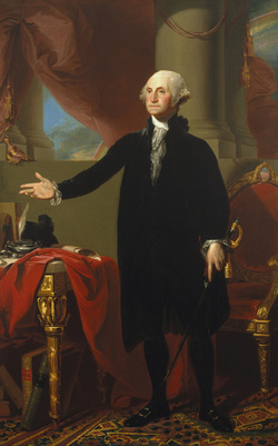 Two pieces read so far this year are very different: one about the infamous libel trial, between James Whistler and John Ruskin, and one discussing the legitimacy of the paintings of George Washington by Gilbert Stuart. Although these readings have varied topics, some themes are common. One theme is of legitimacy in artwork. James Whistler's legitimacy as a true artist was questioned when the critic, John Ruskin, said his painting was "flinging a pot of paint in the public's face" (3). In contrast, the legitimacy of a work of artwork was questioned by the National Portrait Gallery Director, and the artist, Gilbert Stuart, himself (2). Another shared theme is the weight given to certain works of art. Although Gilbert Stuart disavowed the full length portrait of George Washington, it is considered a prominent and important American painting, which First Lady Dolly Madison rescued from a fire besieging the White House (2). The painting Nocturne in Black and Gold: The Falling Rocket by James Whistler also carried weight, but in a different way: it filled Whistler with bruised pride and ruined him financially, and broke down John Ruskin mentally. The two readings provided different perspectives on trends in different historical periods. For example, Gilbert Stuart (may or may not have) done the painting of George Washington in 1796 (2). He was one of the most popular American artists at the time. His artwork was traditional in style and composition, and was made to be as realistic as possible. It was also a distinctively American painting, with the simplicity of the first president's clothes contrasting with the opulence of his surroundings. His posture and expression command power, showing that the President Washington had control as a straightforward man in this land of new wealth and beauty. The painting that caused strife between Whistler and Ruskin was painted nearly a century later, in France. At that point in time, there was a transition into modernism, foreseen fearfully by Ruskin (2). The painting was whimsical and almost abstract, a far cry from traditional works of art. In America, with Gilbert Stuart, he fought to say that his socially accepted and well received work was not his. In France, a century later, James Whistler fought in court to state that his painting was, in fact, art. In both readings, there is strength in that they give a sense of atmosphere: one can visualize the dramatic libel trial between Whistler and Ruskin, one can imagine George Washington posing begrudgingly for his portrait, and one can imagine the two very different art worlds in two very different times and places. Another strength of the pieces is that they both provide historical background about the different perspectives on art. In the Whistler vs. Ruskin piece, it describes the historical background of the art world at that time. In the piece about Gilbert Stuart, historical background is shown about the different critics and artists thoughts on the painting of George Washington at different moments in time. The reading on Whistler vs Ruskin has strength because it is not only descriptive about the two parties, but about the painting Nocturne in Black and Gold: The Falling Rocket and the other works favored by Ruskin at that time. Some weaknesses of the pieces are that the reading on Whistler vs Ruskin does not leave room for individual interpretation and has a strong bias. The reading on Gilbert Stuart does not give much information on the art itself but focuses solely on the mystery surrounding the portrait. What I found most interesting about the piece on Whistler vs Ruskin was how the trial essentially solved nothing. Whistler, despite his dramatic defense and moving speeches, was left ruined financially. Ruskin retired soon after, due to his grief and a mental breakdown. Abstract art and modernism, understood by both artist and critic, was not understood by the judicial court, and nothing came of the trial. What most surprised me about the reading on Gilbert Stuart was that an artist could disavow a work, especially one that was well received. That this, one of the most famed and most seen American paintings, could be disavowed by the artist and questioned was astounding. It also surprised me that people are still discussing the legitimacy of this work and are not trusting the opinions of art historians. 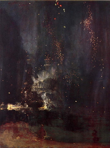 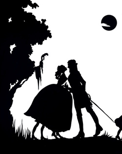 Gone, An Historical Romance of a Civil War as it Occurred between the Dusky Thighs of One Young Negress and Her Heart [detail], 1994
Kara Walker Cut paper (21 paper silhouettes) original and templates w/signed certificate 180 x 600 inches 396.2 x 1524 cm Kara Walker is a contemporary artist who uses black and white paper silhouettes to make statements on race, gender, human behavior, and power. She was greatly influenced by historic and current power struggles, shame, and kitsch in America. REACTION My absolute favorite aspect of this work is how the simplicity and seeming kitschiness brings out the greater issue and standpoint. From one perspective, this appears to be a paper cut out of a woman and man, silhouetted, kissing in the moonlight. But Walker's themes of race, gender, and power are evident: the African American is leaning towards the man, who has a posture of dominance. The man has a human on a leash behind him. Besides the artist's strong message, I also like the use of black and white to create the shapes and figures, with the images in black and the negative space left to the imagination. I find this especially influential and valuable since figure drawing is an important and current part of Art Class this year, and these paper cut outs are essentially filled in contour drawings. 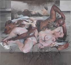 JENNY SAVILLE
Odalisque, 2012–14 Oil and charcoal on canvas 85 7/16 x 93 1/8 inches (217 x 236.5 cm) Jenny Saville is a contemporary, feminist artist who is preoccupied with human flesh, completely natural, with all of its flaws. Her work is shown somewhat realistically from afar, but when it is closely examined her strokes are full of energy and rough, with seemingly random lines (like scratch marks) dancing across the canvas. The title of this work, in Saville's first solo gallery, is odalisque, which is Turkish word for female slave or concubine. The work plays with light, mirrors, and shadow, but the primary focus is the figures and expressions of the figures depicted. REACTION My favorite aspects of this work are the use of light and color, as well as the detail to expression. From a distance, the intertwined figures seem three dimensional and nearly photorealistic. Yet the real beauty is up close: the colors as highlights and shadows are not placed at a whim, but are strategic to make the painting seem as much like form as possible. The contrast between lights and darks and reflection of the mirror make the painting seem vivid and dynamic. Additionally, the expressions of the people reflect the title of the painting: the man seems powerful and possessive despite his obvious vulnerability, while the woman appears weary and lost. Portions of the painting, such as values, love of figure drawing, and feminism influence my personal art as well. The main theme of this work, about the subjugation of women, would play into what we are learning about the historic role of women in patriarchal societies in Global Studies. Earlier this month, we saw an exhibit at the Visual Arts Center of Richmond by Bob Trotman. His exhibit was titled "Business as Usual", and was part installation, part sculpture, and part something very, very unique. Bob Trotman was the son of a prosperous businessman, who went to college and received a degree in philosophy. He now has a studio in the mountains of North Carolina, where he is somewhat reclusive. His work is done primarily in wood. He stresses how pointless and dull mainstream life is; the main theme is "corporate purgatory".
REACTION I was utterly blown away by this exhibit. It left me feeling both awestruck and somewhat creeped out. I was awestruck for a number of reasons. One was that I was impressed by the mechanics of his work. While some were just sculpture or sketches, many of the pieces had literal movement or incorporated modern technology. The main reason that I was impressed, though, was that Bob Trotman managed to clearly and movingly make a statement about society. His points could not be misconstrued; they could either repel or inspire. However, it made me pose a few questions about his work, besides the rudimentary "how is that bucket not overflowing?" type questions. I wondered what the significance of wood, the primary material in his work, was (Note: in his artist's statement he says he used wood carvings as a contemporary version of religious figures or the figureheads of ships). There also appeared to be a recurring motif of hands in his work, which I assumed was because hands carry out artwork but also are the tools to make life decisions. It was also fascinating to make inferences about Bob Trotman's influences: in an act of rebellion against his father and the conservative town he resided in, he went to college to become a philosopher, then became a reclusive artist making anti-corporate work. Over the past week, I have made a lot of progress on my replication of Michelangelo's Study of Libyan Sibyl. I quickly found that much of the texture seen in the work comes from the woven paper, while Michelangelo's stroke consisted of cross hatching and smudging. I was very swift in my work, so I had to pause to reassess. I remedied the issues of drawing too darkly and smudging too much by lightly pressing some areas with a kneaded eraser. 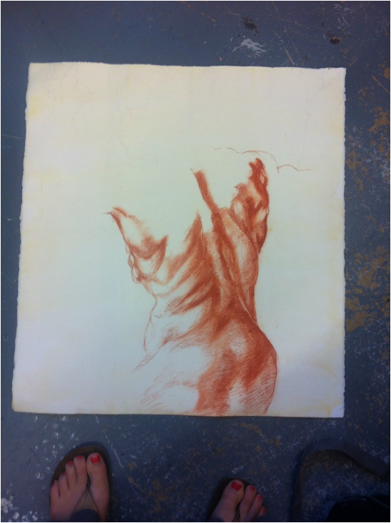 |
CategoriesArchives
June 2017
|
 RSS Feed
