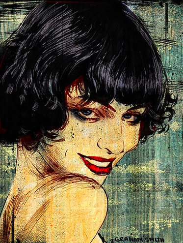
One of the artists whom I found recently I found through Coach Hall's suggestion: Graham Smith, a San Diego-based illustrator and artist. His art is really fascinating: it looks like amplified and highly detailed comic book illustration. He doesn't generate artwork on his computer, but instead uses pen, pencil, and markers. This is impressive, because making many illustrations takes a long amount of time that would be more easily done using software on a computer. I also find his use of line quality and color very compelling. Personally, the use of different color or blocks of color to correspond with different lines to create value is something I would like to emulate. Some of his work is actually really similar to how I draw naturally (when I am not trying to be photorealistic). However, his seems intentional, and mine is just poor proportioning and weird, personal standards of beauty.
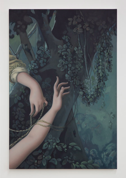
Another artist whom I encountered is Jesse Mockrin, a Los Angeles based figurative artist. Her art is portraiture/figurative work that seems air brushed to have somewhat rubbery features reminiscent of a Botero painting. Mockrin's palette is generally cool or neutral. But I connected to her work in that she also uses strategic cropping to make the figure appear disjointed!! It makes her work look like a traditional portrait that was cut over and over and rearranged separately. My favorite is an image of ghostly pale hands entwined with rope, creating ambiguity not to what is pictured, but why. Mockrin, like me, also has always been drawn to figurative work (pun intended), explaining that, "In high school, when my painting class took a field trip to do plein air landscape painting, I painted a picture of my legs instead. I feel like I have always been able to see the figure better than anything else and gravitated towards painting it." I deeply admire her cropping and hope to use that effectively in my work as well.
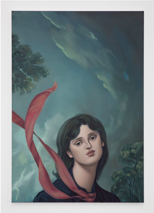
Another artist whom I encountered is Jesse Mockrin, a Los Angeles based figurative artist. Her art is portraiture/figurative work that seems air brushed to have somewhat rubbery features reminiscent of a Botero painting. Mockrin's palette is generally cool or neutral. But I connected to her work in that she also uses strategic cropping to make the figure appear disjointed!! It makes her work look like a traditional portrait that was cut over and over and rearranged separately. My favorite is an image of ghostly pale hands entwined with rope, creating ambiguity not to what is pictured, but why. Mockrin, like me, also has always been drawn to figurative work (pun intended), explaining that, "In high school, when my painting class took a field trip to do plein air landscape painting, I painted a picture of my legs instead. I feel like I have always been able to see the figure better than anything else and gravitated towards painting it." I deeply admire her cropping and hope to use that effectively in my work as well.
 |  |
 RSS Feed
